Watchdogs Urge SBOE to Improve Balky Campaign Contribution Tracker
Reinvent Albany, Citizens Union, and five other watchdog groups sent a letter to the State Board of Elections last week urging further improvements to the Public Reporting System, which publishes campaign finance data. Since its launch last year, the Public Reporting System has improved, and the groups praised SBOE staff for being responsive to previous suggestions. Unfortunately, the new system remains glitchy, hard to use and does not meet public expectations. In their letter, the groups asked SBOE to make numerous specific improvements, including some critical fixes.
The letter is here and below.
NYS Board of Elections
John Conklin
Hope Hardwick
Donald Robarge
Jennifer Wilson
VIA EMAIL
August 2, 2022
Re: Fixing critical problems that reduce usefulness of the Public Reporting System
Dear State Board of Elections staff,
Thank you for the work you’ve put into improving the Public Reporting System over the past two years, and for your responsiveness to our concerns. While the Public Reporting System has come a long way, we continue to experience issues with the platform and are regularly asked by journalists how to use it. We strongly support the Public Reporting System and believe it is a key tool for improving the transparency of campaign finance activity in New York. Please accept our recommendations in that spirit and know we are happy to help however we can. Below is an overview of our assessment followed by a more detailed list of usability issues.
Works Well
- The campaign finance data has been updated in a timely manner, such as for the 32-day and 11-day pre-primaries.
- Data filtering works more quickly and takes less time to update.
- Helpful new data has been added, including ballot access/who has filed.
Does Not Work / Must Be Improved ASAP
- The search function is still too hard to use. This is the main issue that we continue to receive inquiries about.
- The drop-down menu in fields loads too slowly.
- “Search” often loads slowly and regularly never stops loading.
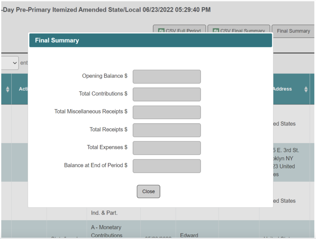
- There are too many glitches on the portal that force users to start over (loss of functionality after brief inactivity, final summary windows appearing empty, etc.).
Needs Improvement
- Still not easy to find on SBOE website. Various stakeholders tell us the Public Reporting System is difficult to locate. We think this is because it’s buried under “Campaign Finance” in a long list of options, and because the name, “Public Reporting System,” is unclear. We strongly recommend putting the words “Campaign Finance” in the name of the system (e.g., “Campaign Finance Portal,” “Campaign Finance Reporting System,” etc).
- The front page does not contain any links to search portals. These are only accessible from the top menu and submenus.
Please see the attached appendix for more, and contact Tom Speaker at (929) 888-4683 or tom@reinventalbany.org if you have any questions.
Thank you,
John Kaehny
Executive Director
Reinvent Albany
Noel Hidalgo
Executive Director
BetaNYC
Betsy Gotbaum
Executive Director
Citizens Union
Susan Lerner
Executive Director
Common Cause New York
Laura Ladd Bierman
Executive Director
League of Women Voters of New York State
Diane Kennedy
President
New York News Publishers Association
Blair Horner
Executive Director
New York Public Interest Research Group
Cc:
Anthony J. Casale
Douglas A. Kellner
Peter S. Kosinski
Andrew J. Spano
Kristen Zebrowski Stavisky, Co-Executive Director
Todd D. Valentine, Co-Executive Director
Appendix – Detailed Comments
Below is a list of notes compiled by Reinvent Albany and Citizens Union detailing issues with the current Public Reporting System, based on the experience of a user connected via high-speed internet and desktop browser.
Improvements (New)
- Campaign finance data was updated for the 32-day and 11-day pre-primaries.
- It takes much less time to process filtering.
- Dates after the current date removed from the Date Range.
- The addition of ballot access/who filed is a welcome change (although unrelated to campaign finance).
- Totals expended now appear in independent expenditure search results.
- It is easier to find the Public Reporting System than before – one can hover the cursor over “Campaign Finance” then see the text, “Public Reporting System.” We still think it can be made easier to find – see below.
Suggested General Improvements
- Change the name – “Public Reporting System” does not make it clear what’s being reported. We believe that the title should include “Campaign Finance.”(New.)
- For “Release Notes,” add list of pending fixes and when they will be addressed.
Ease of use issues:
- The front page does not contain any links to search portals. There is no clear “homepage” that allows users to click through to all the data available; the links to the actual search portals are only available through the menu and submenus. We recommend adding links on the front page — a user should be able to click “List of Filers” to go directly to that search portal. (New.)
- The process for filling out fields is still too confusing. This continues to be the main issue with the site. It is not user-friendly, and we continue to receive questions from well-informed journalists about how to navigate it. For example, in “Search Contributions by Recipient,” a user who wants to search “Hochul” can type “Hochul” then click “Search,” but instead of searching results, a new field pops up (Select Candidate). (New.)
- It is also not clear where to start. Users do not know whether to first click “Search” or “Go.” So it is possible that users will fill out the top menus without pressing “Search” then press “Go” below, and never get any results.
- Solution: We recommend only having one Search button (and no Go buttons), as on the New York Open Government website.
- Users can also press the ‘Search’ button when they haven’t filled out all of the required fields. The button should be made unavailable until the required fields have been filled out.
- It is also not clear where to start. Users do not know whether to first click “Search” or “Go.” So it is possible that users will fill out the top menus without pressing “Search” then press “Go” below, and never get any results.
- The drop-down menu is still too slow when filling out fields in the portal.
- Load times when you hit “Search” can still be slow. Often the portal will continue “Processing” to no end.
- If a user leaves the page even for a few minutes, they have to start all over. This has been an issue since the beginning.
- No permalinks within the system. The previous version of the portal had permalinks for every committee and disclosure report. We also recommend creating permalinks for search results.
- Under “List of Filers,” one column says “Action,” then a button that says “Candidate” will appear. The meaning of both terms are not entirely clear. (New.)
- It would be tremendously helpful if users could use the first row in tables to filter results instead of only sorting results A-Z, as it is now. A disclosure report can have hundreds of entries of different transaction types (i.e. schedules), and users often want to examine them separately. (New.)
- When searching for candidate/committee disclosures, the system gives a confusing error message in cases where candidates did not file any disclosures: No candidate or committee record found with search criteria of Committee Name of “[NAME] – [ID number] “, Filer Type of “All”, Status of “Active” and Search By of “Committee”. It is unclear from the error message if the candidate failed to file disclosures or if the user failed to use the search function properly. It would be clearer if the error message would say something like: No disclosures found for this committee. (New.)
Data issues
- If one goes to “Expenditures,” enters “Hochul,” the “Authorized Committee” field does not automatically appear after. One has to click somewhere on the page for the field to appear. (New.)
- When searching contributors or expenditures, many of the people or committees will appear under different names. Even Governor Hochul is listed both as “Kathleen Hochul” and “Kathy Hochul.”
Errors
- Under “Expenditures,” amounts are still listed as required fields even though they’re pre-filled. (New.)
Design issues
- A new “Expand Button” was added to include more data points, but it would be better if users could view all columns at once, scrolling right when additional columns would run off the page. (New.)
- When searching candidate disclosures, results appear on far right side of page, instead of in the center.
Glitches
- If a user is on the “Expenditures” page, clicks “Candidate” under “Search By,” does not fill in the field, then refreshes the page, a candidate name does not appear under “Candidate.” One has to click a different menu option under “Search By” then go back to “Candidate.” (New.)
- Under “Candidate/Committee Disclosures Search,” if a user fills out the fields properly, navigates away from the page, then returns a few minutes later and presses “Search” the portal will say that no records were found.
- Under “Candidate/Committee Disclosures Search,” if a user enters “Hochul” under committee name, clicks 27197, then clicks 16851 under “Candidates,” a new field Candidate pops up asking for the user to click 27197 as an option.
- If a user fills in tables, then refreshes the page, the page will refresh with the tables still filled in, but no way to get to sub-fields to appear.
- The “final summary” popup window often appears empty. See below:


